

Plan a contractor yard sign with a clear service, readable contact details and a proof checklist. Learn what to simplify before ordering signs for Delaware jobs.
The strongest starting point for a contractor yard sign is one service, a recognizable business name and one clear way to respond. The sign has a small space and a specific setting. It should help a nearby homeowner understand the work without requiring them to study a miniature brochure.
This guide covers the design decisions to make before ordering. It does not promise a number of calls, a universal reading distance or permission to put a sign in a particular spot. A useful layout starts with the location and the job the sign needs to do.
Start with the reader and the location
A sign beside a residential driveway has a different audience from one inside a booth or near a pedestrian entrance. Think about who will see it, where they can safely pause and what may block the view. A hedge, parked vehicle or neighboring sign can make an otherwise clear design ineffective in that setting.
Ask what the reader needs to understand first. For a contractor working on a kitchen, that may be the type of remodeling. For a lawn-care business, it may be the ongoing service available in the neighborhood. These are illustrative examples, not claims about projects completed by ZeroDegree Signs.
Take a photograph of the proposed location from a safe position and share it with the designer. Include the planned sign size and orientation. The design should respond to those conditions instead of starting with a crowded template and hoping it fits.
Put the service ahead of the service list
Choose the main message before choosing colors. “Deck Building” or “Lawn Care” can communicate a service quickly. A paragraph naming every task the company has ever handled forces the reader to sort through competing information.
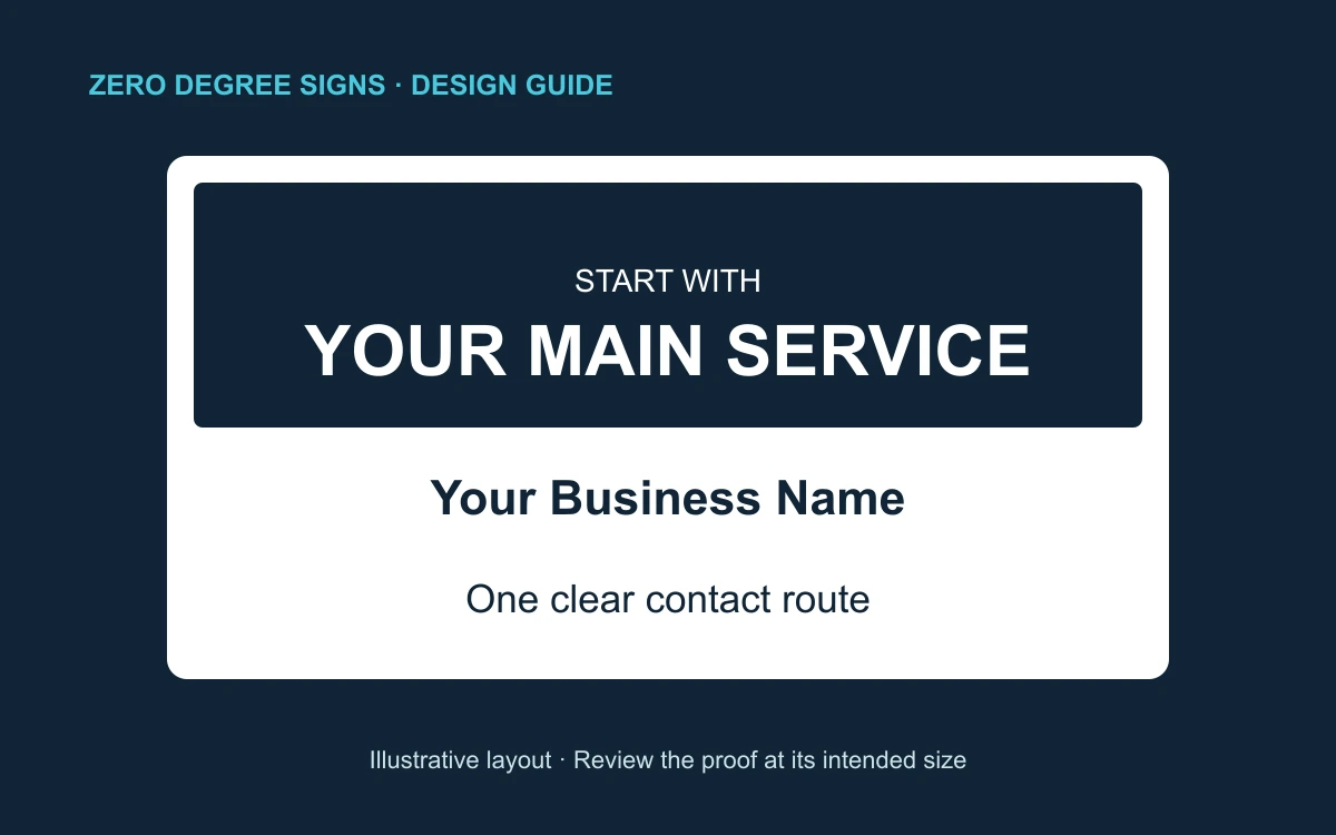
A practical hierarchy is:
- Main service: the reason a nearby homeowner might care.
- Business name or logo: who is doing the work.
- Contact route: the next step for someone interested.
This is a design starting point, not a fixed order for every brand. A short, well-known business name may lead the layout. A complicated logo with a tiny tagline may need a simpler arrangement for this application.
Keep claims accurate. Do not add “licensed,” “insured,” a certification badge or a guarantee simply because it fills an empty corner. If a qualification matters to the message, supply the correct wording and confirm that the claim applies to your business and the advertised work.
Make lettering and contrast do the work
Favor clear letterforms with enough weight to remain visible in the intended setting. Decorative scripts and very narrow lettering can make a phone number or unfamiliar business name harder to recognize. A logo can retain its character while the service and contact line use simpler type.
Keep important words away from busy photographs, textures and low-contrast color combinations. A bright accent can guide attention, but every line cannot be the loudest part of the sign. Check a grayscale preview as a useful way to spot areas where similar tones blur together; then review the actual colors in the final proof.
Leave space between the headline, logo and contact line. Empty space gives the main information room to stand apart. It is not wasted printing area.
There is no reliable single letter-size formula for every jobsite. Font shape, contrast, viewing angle, distance and obstructions all change the result. Review an actual-size proof or a representative printed section. If the main service disappears when you step back to the intended safe viewing position, simplify the layout before making the lettering smaller.
Choose one primary contact route
A phone number works only if it is correct and someone can respond through that number. A short website address works only if it is easy to read, remember and type. Choose the route that fits how your company actually handles inquiries.
For a phone-first sign, make the number visually distinct from the service line. Read every digit aloud during proofing and compare it with the actual business number. Do not assume the designer’s source file is current because it came from an old business card.
For a website-first sign, send people to a useful page about the advertised service. The page should repeat the business identity, explain the work and offer a clear contact step on a phone. A sign about deck work should not lead to an unrelated promotion or a broken page.
If you need several social handles, an email address, two phone numbers and a full street address, put the detailed information on that destination page. The sign can introduce the business without carrying every contact option.
Use QR codes for people who can stop safely
A QR code is an optional bridge to more information, not a substitute for the main message. It is most useful where a person can approach the sign and scan safely. Do not design around drivers scanning from moving vehicles.
Keep the code separate from decorative artwork and preserve clear space around it. DENSO WAVE’s QR-code guidance explains the required quiet zone around a standard QR Code. Do not crop that margin to squeeze the code into a corner.
Test a printed proof on more than one phone, in the expected lighting and at a practical distance. Scan the actual final code, not an earlier mockup. Confirm that the destination is the correct live page and that it remains usable without a login or unexpected app download.
If you use a paid redirect or “dynamic QR” service, understand who controls the destination and what happens if the subscription ends. A readable phone number or short URL gives the reader another way to respond if scanning is inconvenient.
Check size, sides and production details before approval
Choose the physical format before finishing the artwork. A layout made for one proportion should not be stretched into another: that changes the logo, letter shapes and spacing. If you need multiple sizes, have each version checked deliberately.
Decide whether the sign needs printing on one side or both based on the actual viewing directions. Do not assume two sides will be visible from every placement. Confirm the support or stake arrangement and which way the finished sign will face.
Use the production template supplied for the order. Keep essential text and logos inside its safe area, and follow the specified bleed instructions if the background reaches the edge. Bleed and safe area serve different purposes; guessing at either can put important details too close to trimming or finishing.
Our yard-sign page is the starting point for current product options. For a different viewing setting, compare the role of a yard sign with vinyl banners or read our business-sign selection guide. Choose the format for the situation before filling it with content.
Review the proof in this order
Check the message first: can someone identify the service and business without reading every word? Then check the contact route, including the exact phone digits, website spelling and QR destination. Finally check the physical order details: size, orientation, sides, quantity and support arrangement.
Ask someone who did not write the copy to review it. Have them tell you what the business does and how they would contact it. If their answer is unclear, removing a secondary line may help more than adding another badge.
Send ZeroDegree Signs your logo, the main service, final contact information, intended size and a photo of the proposed setting when you request a quote. Mention whether the sign is for a jobsite, neighborhood promotion or another use. That gives the layout a clear purpose before the proof begins.
Frequently Asked Questions
Start with the main service, business name and one clear contact route. Add a short qualifier only if it helps the reader decide whether the work is relevant. Avoid squeezing a full service list onto the sign.
A QR code can help someone who is close enough to stop and scan safely. Keep a readable contact option as well. Test the printed code on multiple phones and confirm that the destination opens the intended page.
There is no single size that works for every location. Available space, viewing distance, angle, lighting and nearby obstructions all matter. Review the layout at actual size and test the main message from the intended safe viewing position.
Get a Free Quote from ZeroDegree Signs
Serving Wilmington, Newark, Bear & all of New Castle County, DE.

